Monday, December 2, 2013

Module 15- self portrait

Self Portrait with hat and veil
1906- 1907, w 798 x h 896
Oil on Canvas

 photo images_zps2bff93ec.jp

Self Portrait Vincent Van Gogh
Oil on Canvas, 1887

 photo djeni_zpsc53b27eb.jpg

Self portrait Margaret Preston
1930, W 642 x h743 cm
Oil on Canvas

 photo jhuh_zps864b448c.png

Portrait of myself
 photo 505691d7-c04c-4000-8e59-8e640a80dc73_zps26086788.jpg

Self Portrait-
 photo 08c7a23e-2430-4afb-b189-a117109e4241_zps7433b9ee.jpg


1. I selected these inspiration pieces due them looking interesting.
2. I selected to just use a pencil because I feel pencil is easy to use when drawing and can erase and re do it if you make mistakes.
3. I had difficulties drawing this portrait. Drawing is not my thing and I tried to do it as well as I could.
4. This piece represents me because it was a fun time in my life.
5. I used shape to resemble my eyes and eyelashes because they are long and big.
6. I did not like this project compared to the others, I am not a good drawer when it comes to self portraits.
7. I think my final work was okay, it doesn't look that much like me.

Thursday, November 28, 2013

module 15


1. The three peers projects I looked at was Jenna Lettieri’s Looking for Love, Samantha Yorko’s Any landscape is the condition of the spirit and Thomas Cronin’s The visual appeal of modern art.
2. I selected the exhibit Looking for Love by Jenna Lettieri due to enjoying viewing and reading her project. I also did the same theme as Jenna, so it was interesting to see what pictures on love she found and used.
3. I thought it was difficult describing the exhibit in more than a couple sentences. To overcome this challenge I read through the slides over and over again to get more ideas.
4. I like looking at peers art work. I find it cool to see what they thought and found for their certain topics. It’s interesting to see their ideas and how they put their projects and power points together.
5. I would like to read what peers wrote about my work so I am aware of my mistakes and flaws.
6. I would give myself an 8 on the article. I think I answered each question to the best of my ability. I think that I discussed the peer I picked exhibit the best I could describe it.
7. I enjoyed this project due to researching the different paintings resembling love. I also liked creating the power point and designing the colors.

Monday, November 25, 2013

Module 15- videos

The Critics-

1- I learned that the word Criticism helps open up a work, so that people see it in a different way. The music, tv and book critics play a role in peoples everyday lives when watching tv, reading or listening to music. Since mass media influences the population, this video gets us to think of what the critics value and message they are sending. Music that catches our attention is the critic trying to express their opinion or feelings to the world. An in depth look at criticism as an art form, the various ways that renowned critics began their careers and intellect with which all professional critics must approach their own work.
2- This video does not relate to my art criticism project due to it not relating to mass media production. Critics do use love in books, music and on television which gives artists ideas.
3- I liked this film, I thought it was cool to hear Method Man’s opinion on how he feels about critics. I also liked how it showed and talked about different artists, television shows, plays and books.
Greenberg on Pollock
1. Clement Greenberg talks about Jason Pollock’s career and his accomplishments through a interesting interview. Greenberg focuses on Pollock’s work from the mid 40s. He also considers Pollock as an outsider, whose techniques were considered “freakish” Pollock started his paintings on easel then to mural painting which was never materialized. Pollock felt alone in the art world and in the large world as well as Greenberg. Several museums bought Pollock’s paintings but he remained a solitary figure.
2. This video did not relate to my art project theme. I did not include any pictures of Pollock’s because I did not see any that related to love.
3. I thought this video was very dull and hard to listen to. I liked learning about Jason Pollock’s amazing career and his accomplishments as an artist.

Thursday, November 21, 2013

Art Curator Blog

When reading the directions for the project I was very concerned about not coming up with a theme that would be good enough and that I could find 15 or more paintings. I started researching paintings and found some paintings that described love, I right away knew love was going to be my theme. The process of finding the 15 images and getting all the required information needed took quite some time. Putting the slideshow together was fun and I liked the background and the format I used. I had some trouble identifying what was going on in some images and what elements and principles to compare the paintings to. I thought this project was fun and different. I learned a lot and can take a lot of the information with me for future reference.

Sunday, November 17, 2013

module 13-14

1- Lowdown of Lowbrow-

1- A lowbrow is a person regarded as uncultivated and lacking in taste. It is used in relation to pictures of naked woman. Robert Williams an artist, created the word Lowbrow. He has seven books out on Lowbrow. It has a meaning of it's own they say. Isabel Samaras is a famous oil painter. Her pictures are made out of actors. There is a photo of batman and robin kissing. She does it for the attraction and for people to enjoy. Lisa Petrucci says that people relate to the photos of lowbrow which include, Hippy, car and popular culture. Historical events also play a role as well.
2- This video does not fully relate to my theme. Since my theme is love, people are attracted to paintings and pieces that resemble love. Where as Lowbrow's pictures attract peoples attentions as well.
3- I liked this film I thought it was interesting to learn about how different painters and their opinion on Lowbrow.

2- The Tate Approach-

1- Starting in the 1900's to present day now, Henry Tate is very well known. Tate opened up a gallery called the Tate Modern. The first 47 days it was open there was over millions who came to see the gallery. Tate curators developed a new method utilizing theme based on museum sections. The Tate Modern is located in London. It is the most visited modern art gallery in the world. They have 47 million visitors per year.
2- This video did not relate to my theme. This video was more on galleries and sectioning of museums.
3- I thought this film was okay, It was interesting to find out information of the Tate modern gallery. I thought it was amazing that they have 47 million viewers per year.

3- Bones of Contention-

1- 10,000 Native Americans unearthed at archaeological sites across the U.S are in possession of museums. The video shows the museum Smith Sonian where the bones are located. Anthropologists and archeologists have studied these remains. They took 26 white people from their grave to review their remains from many years ago. Sculptures are not allowed to be made or created with human bones or pieces.
2- This video did not relate to my theme due to it being focused on bones.
3- I thought this video was very interesting. I thought it was cool that they studied human bones from underground. I always have wondered if researchers or archeologists studied human bones for their research or to figure something out.

4- An Acquiring Mind-

1-Filllipe De Montebello is the 8th and longest serving director at his museum. Acquisition of 84,000 works of art. Montebello was born in France and went to Harvard. He was a distinct show case for European art. In 1871 the museum opened with 174 European paintings. Most of the paintings were of Europeans and dutch masters. Montebello's goal in his museum is to grow to represent all continents, eras and cultures. 1 million objects are contained in the growing collection. German artist Otto Dix, worked between 2 world wars. Montebello saw the painting in Berlin and at first didn't like him. When he saw his one painting he had to buy it and Dix grew on him. When figuring out what new piece to put into the museum it goes through a voting process and art curators.
2- This video did not relate to my theme, because I did not get to see many pieces relating to love.
3- I liked this video. I thought it was cool to learn about how each piece goes through a voting process. I just thought whoever the director is decides and that's that.

Sunday, November 10, 2013

Module 12

Hockney on photography

1-I chose this video to watch because it sounded interesting. Photography interests me and I thought it would be different techniques and photo shoots.
2- I learned that the camera is older then photography. I found this hard to believe! During the 19th century is when the mechanical process of the camera was established. Hockney is a painter that takes pictures with a camera and makes them something fantastic. He started with a polaroid camera which was made in Los Angeles. Hockney makes collages of pictures he takes. Most of his pictures are shown on grids as collages. He was the first artist to design and create collages.
3- This video relates to the photography part in our books. They are similar in the description of photography and the process of the art.
4- I liked this video. I think it is a cool talent to take pictures and create collages or to be a photographer. It was cool to learn about his experiences with photography and the steps it takes him.

Andy Warhol- Images of an image

1- I chose this video because I recognized the name Andy Warhol. I have seen paintings from the art gallery and in our text so I was interested in this video.
2- Andy Warhol became an artist later in life. He wanted to be a tap dancer at first. He enlarged pieces in magazines, coke bottles and other types of public media. Andy collected magazines and pictures of famous actresses. He first designed different photos of Marilyn Monroe. He became famous from these photos. He then became interested in Elizabeth Taylor's photo and life. He would print pictures of her and her husband. Warhol remade Taylor's break up on the front of the paper. He also designed images from when she was Cleopatra, which was a top movie star.
3- This video did not relate to the text as much as previous videos. Andy Warhol is a artist that is talked about often.
4- I liked this video due to hearing about famous actors and what he created using their photos. I like videos that go into artists lives and talk about their past experiences, challenges and accomplishments of where and how they are today.

Tuesday, November 5, 2013

Module 11- Art gallery 2

Step 1-

Title of exhibit- Albright Knox Art Gallery
Theme- Paintings and pieces made by famous artists

Step 2-

Type of lighting- They used white spot lights located on top of the ceilings. Two of the spot lights would shine directly on each painting.
Colors on walls- On the walls they were painted white. I think they are white so the pieces can stand out because most of them are so colorful.
Materials in interior- Stairs and platforms are used in the gallery to resemble space. Also around some of the paintings there were little black railings.
Movement of viewer- Viewers viewing the art gallery walk around in amazement. They walk slow and like to stop and view the paintings. I would say their movements are slow and not rushed.

Step 3-
Artworks organized- The artworks were spread out to give enough space and time at one piece. It seemed to be that some circle and stripe paintings were together in certain rooms.
Artworks Similar- Some artworks were similar as in artists and the view of them.
Artworks different- Artworks were very different by their color, shape and size.
Framed- Each painting seem to be on 3-d poster boards. Some of the paintings have a black frame around them.
Identified and labeled- Next to each piece was a description of the picture, artist and year it was made.
Proximity- Each piece had a good distance to the next. Some pictures were whiles away where as some were about 30 inches.

1st pic-
Polarity
Peter Sedgley
Acrylic on canvas
Made in 1966

 photo 002_zps19fb8cb2.jpg
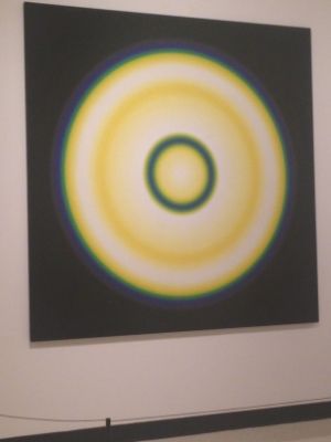
Looking at this piece looks like something you would see in a science class. It looks like somewhat of a planet. It also gives a illusion looking in the center of the circle. Using the element illusion can catch peoples attention to look at it at a different perspective. In the piece it shows thick lines of a circle and thin. The blend of colors make it look more interesting and pleasing to look at. I think the artist was trying to perceive a illusion and make people want to know more.

2nd pic-
Julio Leparc
Serie 14
Acrylic on canvas
Made in 1970
 photo 67963b97-384d-492a-bcd0-bbdeaaadade0_zps95947514.jpg

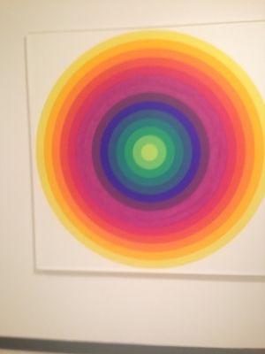
In this piece I see lots of beautiful colors, it like takes your breath away. It reminds me of a planet or something that is incredible but you don't know what it stands for. Color was definitely used in this piece to catch viewers eyes. This piece uses shape as well. The colors stand for a rainbow and are circular which defines each color. This piece reminds of a rainbow and of happiness. Looking at this piece can brighten up someone's day. I think the artist was trying to create a piece that defines happiness and a bright future. Bright colors make people look happy and alive as well as this piece.

3rd pic-
Karl Gerstner
Made in 1964
Lens Picture
Plexiglas lens mounted on paint
 photo d5f417b2-3db5-4939-b0de-206ee5b73d3e_zps2cdb9c9d.jpg
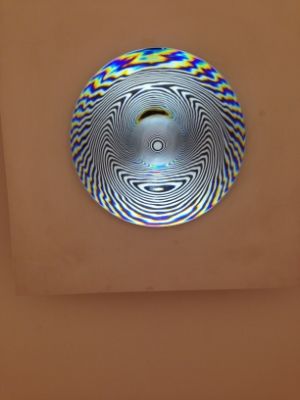
Looking at this piece was one of my favorites to look at here at the art gallery. I had to squint when looking to get the full effect, you squint without realizing it. The piece has illusions of circles that seem to keep circling. The whole piece is black and white with no other color. This piece reminds me of a plate or something you would see in a fun house. The artist uses color and illusion to show different types and techniques of art. I think the artist was trying to get a fun reaction from people. Most pieces you see don't give a illusion and are fun to look at.

Wednesday, October 30, 2013

Module 11- Video Blog

Matisse & Picasso-

1- I chose this video for a couple different reasons. In previous art classes I have taken we have talked about Picasso and I also seen some of his paintings at the art gallery. I never heard of Matisse and I know who Picasso is so I figured this video would be beneficial to watch.
2- A family called the Steins were the first to buy Matisse's painting which was of his wife. They thought that Matisse and Picasso were similar and should meet. They said they both have the strength of a genius. Matisse was unaware of his talent for the first 20 years of his life. His paintings were soft and gentle. Picasso's paintings they showed looked scary and evil. These paintings resemble "Life's a bitch". Matisse's portrait of his daughter, Picasso loved and kept it for as long as he lived. In 1912 Picasso invented the first collage which was made by cloth. Matisse's lifeline is the Arabesque. Dance was a symbol in his paintings that looked like sculptures.
3- This video relates to the text by stating facts and information about Picasso. They each show their art work and the works that made it big.
4- I liked this video. It was pretty long and hard to stay focused. This video added more depth to my knowledge of these artists by showing more images from them.

Expressionism-
1- I chose this video because expressionism expresses color throughout paintings. I thought it would be interesting to learn how artists represent stories and events through color in their paintings.
2- Expressionism emphasizes color's emotional properties while demonstrating far less concern than the Fauves had with the formal and structural composition of color. The pictures shown use color to demonstrate what is going on and what it is expressing to the audience. Color plays a important role in expressionism.
3-These relates to the text by showing more examples of expressionism. The text states important ideas and facts about expressionism. Where as the video shows many images of color being used to imply a story line.
4- This video was interesting and I am glad I chose it. It adds depth to my understanding of expressionism by all the examples shown from the video.

Monday, October 28, 2013

Module 10- Mask

1- Inspiration Images-


 photo images_zps1e4d19a9.jpg

 photo 2948505d-4dd0-4236-9d1b-4e11491a5ffd_zps53fa6fed.jpg

 photo aa00cee2-79c2-4bb0-b350-06ed609b1725_zps9f12ada2.jpg

2- The masks I chose were an inspiration to my ideas and thoughts for creating my own mask. I like the masquerade masks, they add fun and style. They use color and pattern to represent a certain holiday, tradition or simply used for a costume. I liked how they had the same type of pattern around or along the mask.

3- Sketch-
 photo f56e0f08-be7c-487d-aed5-cd74883b59ff_zps389e1f61.jpg

Final Mask-
 photo 978fc2ea-cc89-4182-a9a9-62d8f91599e6_zpsae1c43a9.jpg

4- In my finished mask I used color to represent the mood. The purple, black and grey represent mysterious and could be worn for a masquerade. I also used pattern in my mask. The pattern repeats itself and mirrors itself on each side. Balance occurs in my mask as well. Each side is the same in shape and size.
5- I thought it was fun creating my mask. I looked at a bunch of different images online to figure out a perfect mask to create. I liked the colors I used and the butterfly as the mask. I liked this project it gave you an opportunity to explore different kinds of masks and their elements and principles.

Saturday, October 26, 2013

Module 10 video

Buddhism


1- I chose this video because I thought it would be interesting to learn in depth facts and details about the religion Buddhism.
2- The religion Buddhism began in India by the name of Siddhartha Gautama. His father was the king and he had everything he could ever want in life. Gautama one day saw the world differently after seeing people living sickness and on the streets. He wanted to send the message of love, gentleness and serenity. Gautama wanted to share his enlightment with people for support. The teaching of Buddhism spread through India. After Gautama died Buddhism spread 2 different ways, the monks and Vinaya. During the 3rd and 7th century Sanche became the center of the Buddhist art and architecture. The great stoop is where people and pilgrims go to admire the Buddha gallery and life. Pilgrims from all parts of India made their way to the great stoop and the great gateway.
3- This video added more depth to my learning of Buddhism religion by showing more detailed photos and places that explains and symbolizes Buddhism.
4- I really liked this video. I am happy I chose it because it was interesting to watch and it wasn't boring like some other videos we have watched.

Hinduism-
1- I picked this video because I am interested in learning about the different cultures and religions from millions of years go.
2- I learned that the Great river Ganges was a powerful symbol to the Hinduism people. It was symbolic for god's love of earth and people. To the Hinduism people they believed in death and re-carnation. They used to burn people when dead because they believed their spirit and soul would come back to life. The Christian Hindu's believed in millions of years through rebirth and death. In the video they had a ceremony representing mother nature of the great river Ganges. Oil lamps were offered and were important in art and architecture. Hindu's invested in tiny shrines and their decorations.
3- The text and video do provide similar information about Hinduism. The video shows ceremonies, what they do to dead bodies and how the great river Ganges affects their way of living.
4- I liked this video because it taught me many things about the Hindu's. I thought it was interesting their perspective on birth and re-carnation along with rebirth and death.

Monday, October 21, 2013

module 9 project

 photo cd2e0257-a080-4c52-9b0d-d7f47c9d7dbb_zps827f9a45.jpg


1-I thought using your hand for this project was easier than the other projects. I would rather draw or trace an object than drawing something made off the top of your head.
2- I used a pencil when drawing this project. I think it's easier to draw with a pencil rather then anything else. I feel more comfortable using a pencil when drawing so I can erase if I need to or make a mistake.
3- I actually did not like using my non dominant hand. I found it a lot harder because I never try to use that hand to draw or write, so it felt uncomfortable. I found myself getting aggravated because it was very difficult.
4- I think my drawings are decent. I do not usually draw so I see this as a pretty good drawing. It took me a couple try's to get it the way I wanted it too. I do think using my dominant hand was a better drawing.
5- I would never consider using my non- dominant hand for a drawing in the future. It felt extremely uncomfortable.

Module 9

Albrecht Durer- Image of A Master

1- I chose this video honestly because it was the first one I clicked on and only twenty minutes. It seems interesting. I like videos that focus on one artists life and career.

2- Gothic art opened new ideas in ancient times. Durer was a very skilled artist and started when he was very young. At thirteen years old he drew his first portrait. When he was 19 he drew a portrait of his master as well. Recently discovered a portrait of Durer's mother. She had 18 children and buried 15 of them. In 1544 in drew a sketch of his mother, which looked to be as she was aging. I knew this because she had creases in her face. Durer made wood cuts which is a german manner. When grown Durer traveled as a craftsmen. He was married when he was 22 to a bride that was 15 years old, from a wealthy family. Two months after the wedding he began his travels again for about 4 to 5 months. His wife gave him no children.

3- This relates to the text by similar topics. For example there are artists in the text that can relate to this artist.

4- The video shows more in depth facts, portraits and paintings. I liked this video. It was interesting to learn about Durer's life. He survived traveling on his own making crafts. People do not do that now a days and wouldn't be able to survive.

Velazquez-

1- I chose this video because it looked different and sounded unique from the rest.
2- Velazquez was a Spanish painter born in 1599 in Seville. Velazquez drew paintings for the King, whatever his request may be Velazquez would deliver willingly. He would draw portraits of the king and his family. When he was 24 years old he was named the court painter to Phillip the 4th. Velazquez saw the king as elegant, ageless and sad. He went to Italy for two years to look, copy and study Italian paintings. Velazquez died in 1660.
3- This video relates to the text by covering similarities between painters around the world and their careers.
4- I thought this video was very interesting. I thought it was cool that Velazquez created portraits for royal people.

Sunday, October 13, 2013

Module 8

Human Video-


1- This video was required to watch, and I'm glad it was. I most likely would of picked this one if it wasn't already required.
2- In the video More human than human I learned facts about the nomadic people. They hunted and gathered in small groups. These people never stayed in one spot and were always moving. I cant imagine living like that! In most paintings and sculptures woman were portrayed with big legs, stomach and breasts, but regular face and arms. People were unsure of why artists portrayed women this way, they guessed it was a symbol of motherhood. Early humans were stimulated by these images and fat was highly desirable. The famous figure was is called Venus. Brain scientists figured out why ancient humans portrayed women this way. Scientists compared seagals to the Venus to complete their findings. They found out that baby seagals are attached to their mothers by the red strip on their beak. Ancient humans were pre-programmed to exaggerate what mattered most.
3- The video and text relate to each other by the same topics discussed. Also there were similar images shown. They both related to the same historical time periods.
4- I enjoyed the video and am glad it was required. I learned a lot and thought it was very interesting. The images shown gave more depth to my understanding of the material. This video showed symbols and places as to where the narrator was discussing.


Art and Life in the Middle Ages-
1- I chose this video because I thought it would be educational to learn in depth facts and history from the middle ages.
2- In the video the author of the prayer book shown and talked about was Luttrell Psalter. In the prayer book they showed monsters, daily life and animals on every page. Whether it be on the top, bottom, middle and in between the lines on the page. Luttrell has images of people on the pages, people seem to think their people he once knew. The images show facial expressions, hair styles and fashion. On one of the pages in the top corner there is a gray face. People seem to think it is Luttrell but no one is sure. In 1315- 1316 these time periods resulted in many people dying. Also in this time farming was the way of producing food. Woman would make cloth and spin. Spinning took a lot of time, they compare this to woman cooking.
3- This video relates to the text by discussing similar facts during the middle ages.
4- I liked this video and happy I chose it as my choose. This video showed different images of people that may have lived in ancient times. Also it showed us a prayer book and taught us about the master Luttrell Psalter.

Thursday, October 3, 2013

Video Blogs Module 7

Architecture- Science of Design-


1. Key concepts learned- There were many concepts that I learned throughout this video. Most of which I had no clue even were decisions and choices while creating a building. I learned that wind blowing on top of a 100 story building is 4 times more violent then on a 50 feet building. The buildings need to have 5-7 seconds to cover farthest and current position, this can cause motion sickness, stop of elevators and damage of the structure. Experts determine how buildings and their surroundings will react under thrust winds. They compare data to meterological statistics from the past 10 to 20 years to predict weather conditions.
2- This video relates to the text by showing us the same type of high rises and buildings. They also both talk about the structures and creations of buildings.
3- I really liked this film I thought it brought more detailed and descriptive images and was a eye opener for how experts create buildings. I never knew there was a whole side of research before building something. This showed me more of a depth of understanding architecture by showing experts steps of how they do things.
4. I choose this film because it seemed interesting while looking through them. I am glad I chose this one because I actually was interesting in it and wanted to learn more.

Frank Gehry- Architecture as Art
1. During the 20th century there is always moving chaos which falls onto sense of movement. Gehry says he felt that what you put in a building connects with the people in the building as well. It gives people feelings and is humanistic. Gehry designed malls, apartments and buildings all around the world. He also developed his own architecture vocabulary that would eventually determine large and sculptural form.
2.In the text we read about other architectures and their experiences, creativity and works. In the video I got the opportunity to learn about another architect.
3. This video was a little bit more duller then the first one I chose. I liked the parts where they showed Gehry and him working on pieces of art.
4. I chose this film because I thought it would be interesting to see and learn about an architects works and past. I like videos that goes inside someone famous or well knowns life.

Peer Blogs

http://kalifoley.blogspot.com/2013/09/art-gallery-visit.html#comment-form


http://jess1cacunn1ngham.blogspot.com/2013/09/my-logo.html?showComment=1380663156904#c974340093382066680

2- While making my photobucket slideshow I saw different elements in a bunch of the pictures I used. Kali's photobucket slideshow she used pictures of her backyard which was a really good idea. I think you can find more of the element in objects outside. Such as contrast and color. For all the pictures she chose for each element I thought went together and made sense. She used pictures that I would of used to describe each element as well. Jessica's photobucket I also thought her pictures matched with each element. She was nervous she was not going to be able to find the right pictures and I thought that as well.
3- Jessica's choice of pieces were different then mine. The ones she picked out were interesting and I see that more now looking at the pictures of them. The convergence by Jason Pollock looks really interesting and I didn't notice it as much as the other ones at the gallery. Kali's pictures she chose were very similar to mine. We both like the Polarity. We all thought the Wood Iron Rods looked like they were moving even though they weren't. I also really liked the stairs when you first walked in, I has to really watch walking down them because they were so filled with colors and stripes, it was very different.
4- Jessica chose the Triumph of the French Painting, which looks really interesting. It looks to me that there is a story behind it that people would like to know more about. It has a variety of colors to make the piece more alive. It also looks like there is emotion behind it as well. Kali chose the "Fog” by Susie Rosmarin. I thought this piece was really cool. I remember seeing it at the gallery and couldn't stop starring at it. So many of the pieces there really make you stop and stare for a while.
5. I think it is interesting to see what other classmates are interested in. Being an online class no one knows each other, so this gives us a opportunity to see what their like. I find it valuable to see how and what other people do for the projects. This is my first art class and a elective so I am basing off the directions not any examples. This assignment shows us what other peoples ideas are and we can learn from them.
6- Even though I did not have any classmates respond to my artwork, I feel this assignment helped me for my future assignments and projects.

Saturday, September 28, 2013

Videos/ module 6

The Sculptor-
1- I learned many key concepts from watching this video. I learned that limestone is developed at the bottom of the sea. When artists are carving sculptures they must use their feelings to make them come to life. The man in the video that creates sculpture says the sculpture becomes real when he can draw or visualize it in his head but if he can not he can not make it. To create a sculpture you need clay, bronze, marble and limestone for it to form. A sculpture becomes alive in clay, dies in plaster and reborn in marble.
2- In the video it shows sculptures and carvings and the text does as well. In the text and video it talks about the same materials required to create sculptures.
3- I really liked this film, I think it brought a better understanding of how sculptures are made and the process of creating these pieces. Actually seeing a artist create these sculptures and paintings make you realize how hard it is and how big their passion for art must be.


Glass& Ceramics-
1. I learned that glass is made from sand. It is made from a vistkis liquid to stiffen. When it is cooled there are many steps to take to cut and create the object such as a vase or wine glass. Silica forms the crystals in ceramics and glass. Ceramics starts off as a clay base that is heated at high temperature. The crystals depend on the temperature that it is heated in. To make a teapot it needs to be heated at 1400 degrees celcius.
2- This video relates to the text because, it talks about glass and ceramics. In the video we get to see how glass and ceramics are made to have a better visual understanding of the steps.
3- I thought this video was really interesting. Seeing how glass is made and seeing someone make a vase was amazing.

Tuesday, September 24, 2013

Art Gallery Blog

Artworks that made a impression or impact on me-

 photo 03488bc6-ce1e-4fe0-aa0c-fd50cb4431a7_zpsb25ae2c8.jpg
Peter Sedgley's Polarity in 1966.
I thought this piece was really cool, it stood out to me over any of the others in the section.


 photo 67963b97-384d-492a-bcd0-bbdeaaadade0_zps95947514.jpg

Julio Le Parc's Serie in 1970.

This piece is my favorite that I saw at the gallery. My eyes could not resist the colors.


Artworks I felt a connection with-

 photo bf344a02-66d1-4b5d-9b48-e748804e659e_zps692411ba.jpg

Francis Celentano's Gamma in 1970.
I felt a connection with this piece because of the blend of colors. I love objects or things that blend into different colors.

 photo 798126f7-e1bc-43ac-941e-121b6e3919ff_zpsded5651d.jpg

Angela Bulloch's Chain A.
This piece was fun to watch. The squares of colors diffuse into different colors every couple seconds. I think its so fun to have lights that change colors.

Artworks I would like to know more about-

 photo c34f6a98-0610-4aaf-9d6d-971cf918285e_zps70f2a9ab.jpg
Jesus Rafael Soto's Wood- Iron Rods in 1964

This piece was really interesting. I wonder how he made it have an illusion and look like a 3D image.


 photo be2d929e-3594-4213-a4a6-9d2111e84e25_zpse462a761.jpg

Pablo Picasso's Harlequin in 1935.
I thought Picasso's piece was really interesting to look at. I did not understand what the meaning behind it is. Or what it may stand for.

Monday, September 23, 2013

Logo

Sketch 1


sketch one photo 008_zpse8575168.jpg


Sketch 2

 photo d8a7bcb6-8c2e-4079-880b-feb25c284ffa_zps8a2657df.jpg


Sketch 3

sketch 3 photo 006_zpse9c8212f.jpg


Final


 photo c401beb3-9e87-4f4b-bbe2-b3be4b8e7bb0_zps62f1e625.jpg


1- I thought it was fun creating this logo. I got a chance to really come up with something creative that I like,
2- When I read that it could be something that identifies yourself I immediately thought of having bows involved in my logo. I love bow everything so I used an eye to symbolize that this was about myself.
3- My important discovery was trying out all the different combinations that went well together. For example the eye being in the middle of the bow than on the side.

Monday, September 16, 2013

color wheel

 photo a0385385-f1f8-48b0-a131-ff5677c4458e_zps1f641f53.jpg Color Wheel  photo 53cf2714-9f93-42f4-9573-92874f34d980_zpsc555212d.jpg Value scale 1. I thought it was actually pretty interesting to create these projects. The wheel was difficult for me that is why I had to cut and paste because I kept screwing the colors up. Same with the value scale, it took a couple times to get it right. 2. I thought working with the paint was more enjoyable then the shades of coloring. I don't usually paint things so it was pretty fun making the colors. 3. The most important discovery is that magenta, cyan and yellow are primary colors and most people do not know that. 4. I thought these videos were educational. I haven't learned anything about colors since I was in elementary school, so it was good to refresh my memory. Especially which colors together make other colors.

Monday, September 9, 2013

Slideshow

matteas1234's art slideshow album on Photobucket

http://s1333.photobucket.com/user/matteas1234/library/art%20slideshow


This project actually was a lot better then I thought it was going to be.  I did not have any technical troubles except for figuring out photobucket. I haven't used photobucket since I was young and there  are a lot of changes. Trying to get them in the same album was a little confusing at first. I thought it was cool to piece together what the elements and principles mean and capture images from your life that fit.

Saturday, September 7, 2013

Module 3/ Blog 3

1-  Color is fun and enjoyable to look at. Color effects peoples emotions in many ways, such as liking objects and things that are your favorite color. When looking at a picture/ image with different colors either dim or shiny are still pleasing to look at. Looking at a black and white photo may not be the most pleasing image. Color can make the mood of the image and what the artist is trying to say. Color can bring peace and silence to a image as well.

2- Color has always fascinated me in many ways. I love to look and buy things that are certain colors that are enjoyable to me. Color to me keeps things alive and looking fresh. Color intrigues people by buying certain clothes or objects or simply just looking at something pleasing.

3-  The biggest impact the color video left on me was the painting The CafĂ© by Vincent Van Gough. Vincent Van Gough had the idea of using bold colors to describe strong emotions. I thought it was cool to learn about how he described a terrible setting, by using unnatural reds and greens. Using these colors he tried to capture bad feelings as bad as to commit a crime.

4- In the feelings video I saw lots of paintings of people fighting. These people were patriotic for their country. Color helps us understand where and why this picture is or was taken place. Another thing in this video was religion. The paintings on the walls in church's help us understand religion and beliefs.

Wednesday, September 4, 2013

Aesthetics & Art

Question 1- I learned many interesting facts from these videos and article. From the video Aesthetics, philosophy of the art I learned about neoclassical aesthetics. Aesthetics is feelings aroused in us by sensory experiences through our five senses. They connect to the world we live in. In the two videos I learned Changeux and Ramachandran's scientific views on art and aesthetics. They discuss how art effects our emotions and why we act certain ways when dealing with art.

Question 2- I feel that Aristole's theory on aesthetics is the most important. Aristole was a greek philospher, born in 384 BCE and died in 322 BCE. Aristole analyzed tragedy by political and ethnical aims. Aristole ignores the concepts of absoulte beauty and seeks the beautiful from the good. This philospher was such a huge contribution to the theroy because of his poetic imagination.

Question3-

 Changeux- Watching Changeux's lecture was very hard to comprehend and understand. I think Changeux's scientific view on aesthetics and art have a great deal to do with genetics, and how our brains work. He goes into great depth of how our brain develops. The most interesting part I found was that it takes a human brain 15 years to fully develop.

Ramachandran- Ramachandran stated in his lecture that the place where art and science meet is in the human brain. Watching Ramachandrans lecture was interesting and educational. I thought it was pretty cool to learn about how he developed his passion for art. When to begin with it was not an interest to him what so ever. Even though the paintings shown were not the best they were still looked at as great work.

Question 4- In the videos a lot of the topics and key concepts were talked about and looked upon in the textbook. Watching videos plus readings in the textbook open our mind to more details and facts about these concepts. Even though these 2 videos were a bit of a struggle to get through I know it is for our better understanding of art.

Question 5-  These films add depth to our understanding of these topics by showing more pieces of art. I feel that watching videos paint a better picture in our minds then reading pages from the text. I think the films and article is very educational and informative. It is interesting to learn about artists history, creative thinking and theories of philosophers.